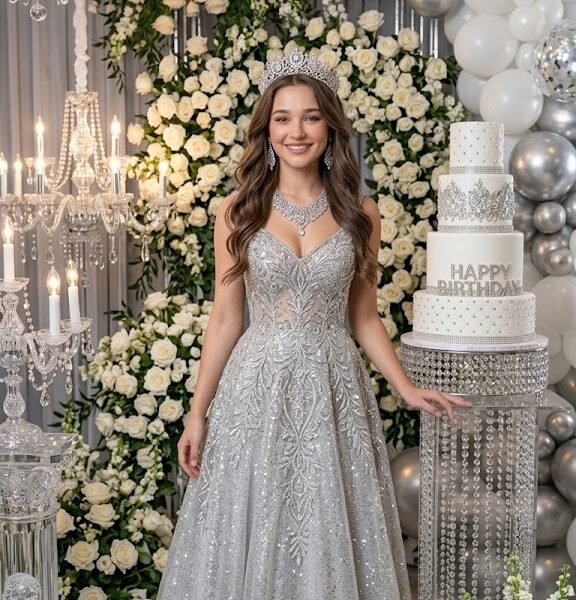
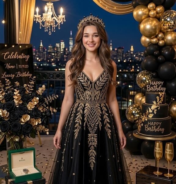
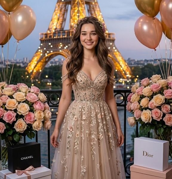
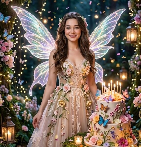
The Complete Guide to Gemini Birthday Prompts for Women
If you've already tried a few AI birthday prompts and gotten a photo that looks "close but off," you're not alone. Most people fix this by adding more adjectives. That usually makes things worse.
This guide explains what actually controls the output when you're using Google Gemini for birthday portraits — the logic behind why some prompts produce a magazine-quality image and others produce something that looks like a phone filter. No fluff, no repeated prompt lists. Just the mechanics.
Also Read: Gemini Prompts for Man Shalwar Kameez
What Makes a Great Birthday Prompt?
A birthday prompt succeeds or fails based on how clearly it separates the things Gemini has to guess from the things you've already decided for it. Every unclear word is a decision the model has to make on its own, and its guess is rarely the one you had in mind.
Subject clarity is the foundation. "A woman celebrating her birthday" gives the model almost nothing to work with — age, ethnicity, hair, build, and expression are all left open. "A woman in her late 20s with long wavy brown hair, soft smile" removes four variables in one sentence. The fewer open variables you leave, the less the output drifts between generations.
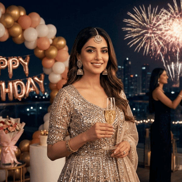
Environment does more than set a backdrop. It tells the model what light sources exist, what colors are already in the frame, and what mood is expected. A garden party and a rooftop lounge don't just look different — they force different lighting logic, different color palettes, and different levels of formality in the outfit.
Outfit needs to match the environment or you get visible tension in the output — sequins at a picnic, casual wear at a black-tie shoot. Gemini will often try to "average" the mismatch, which is where you get strange fabric textures or awkward styling choices.
Lighting is arguably the single highest-leverage word category in the entire prompt. It affects skin tone rendering, shadow direction, mood, and how "expensive" or "cheap" the image feels. More on this in the dedicated lighting section below.
Camera language (lens, distance, angle) tells the model how to frame the body and face. Skip this and you'll often get a default mid-distance shot that feels generic — the AI equivalent of a stock photo.
Emotional expression matters more than people expect. "Smiling" is vague. "Genuine laugh, eyes crinkled" gives the model an actual expression to render instead of a generic photo-smile that looks slightly stiff in most outputs.
Decorations should be specific but limited. Balloons, confetti, a cake, fairy lights — pick two or three, not seven. Overloading the scene with objects competes with the subject for visual weight.
Composition (centered, rule of thirds, close crop) decides where the eye lands first. Leaving this out means the model defaults to whatever framing is statistically common in its training data for the words you did use.
One thing worth noting: none of these eight factors work in isolation. A perfect lighting word paired with a vague subject still produces a generic result, because the model has to fill the subject gap with something, and it usually fills it with whatever is most statistically common in its training data. Treat this list as a checklist to run through together, not eight separate boxes to tick one at a time.
How Gemini Interprets Birthday Prompts
Based on practical use, Gemini seems to process prompts in a rough priority order rather than treating every word with equal weight. Understanding this order helps you place information where it will actually be used.
Subject first. In most cases, whatever describes the person appears to get locked in before the model moves to secondary details. If your subject description is vague or buried at the end of a long prompt, later details sometimes override it in ways you didn't intend.
Clothing before accessories. The core outfit ("emerald green satin gown") tends to anchor the look, while accessories (jewelry, a tiara, a clutch) get layered in afterward. If you want a specific accessory to survive in the final image, describe it concretely rather than in passing.
Lighting before background. Lighting seems to influence the overall image more heavily than background details do. Two prompts with the same background but different lighting words often produce more visually different results than two prompts with the same lighting but different backgrounds.
Realistic wording produces realistic output. Words borrowed from real photography ("85mm portrait lens," "shallow depth of field," "editorial lighting") tend to push the model toward photorealistic rendering. Vague aesthetic words ("dreamy," "magical," "stunning") without technical grounding tend to produce more stylized, less photographic results.
Avoid conflicting styles. Asking for "vintage film photo, ultra modern, glossy HDR" in the same prompt gives the model contradictory instructions. It will try to blend them, and the result usually looks less coherent than picking one direction and committing to it.
Logical order helps. Structuring a prompt in the order a photographer would actually think — subject, outfit, pose, setting, lighting, camera — tends to produce more coherent output than a prompt that jumps between categories randomly.
Prompt Anatomy
Here's a single birthday prompt broken into its functional parts, with what each one actually contributes:
| Component |
Example |
What it controls |
| Subject |
"A woman in her early 30s" |
Age range, base identity |
| Age |
"turning 30" |
Numeric context for decorations/theme |
| Outfit |
"gold sequined mini dress" |
Fabric, color, formality level |
| Pose |
"hand resting on hip, looking over shoulder" |
Body language, energy |
| Expression |
"soft confident smile" |
Facial emotion, warmth |
| Decorations |
"gold balloons, a small cake with lit candles" |
Scene props, color accents |
| Lighting |
"warm golden hour light" |
Skin tone, shadows, mood |
| Camera |
"85mm lens, shallow depth of field" |
Framing, background blur |
| Background |
"rooftop terrace at sunset" |
Environment, secondary light source |
| Color palette |
"gold, cream, soft orange" |
Overall color cohesion |
| Quality keywords |
"ultra realistic, high detail" |
Rendering fidelity |
Each of these is a lever. Change one and the whole image shifts — this is why testing one variable at a time (covered later) is more useful than rewriting the entire prompt each time something looks wrong.
The Layered Prompt Formula
Call it what it is: a sequence, not a random pile of adjectives. Subject → Outfit → Pose → Setting → Decorations → Lighting → Camera → Color → Quality. Each layer builds on the one before it, which is why writing in this order tends to produce more coherent results than writing in whatever order ideas occur to you.
Use this as a skeleton and fill in the brackets:
A [age/adjective] woman with [hair description], wearing [outfit + fabric + color],
[pose description], [facial expression], celebrating her [Nth] birthday in a
[setting/location], surrounded by [1-2 decoration elements], lit by [lighting type],
shot on [lens/camera style], [color palette], [quality keywords]
What each placeholder does:
- Age/adjective — sets the generation and general styling era (e.g., "24-year-old," "woman in her 40s")
- Hair description — length, texture, color; prevents the model from defaulting to a generic style
- Outfit + fabric + color — the single highest-impact visual element after the subject
- Pose — controls energy and body language; avoid generic "posing for photo"
- Facial expression — should be specific, not just "happy"
- Nth birthday — gives context for age-appropriate styling and decoration choices
- Setting/location — the physical space and implied light sources
- Decoration elements — keep to 1-2 for a clean composition
- Lighting type — the most important single word choice in the prompt
- Lens/camera style — controls framing, depth of field, and "photographic" feel
- Color palette — ties outfit, decorations, and lighting into one cohesive look
- Quality keywords — nudges toward photorealism over illustration
Prompt Quality Score
Not every prompt has the same chance of producing a realistic, polished birthday portrait. Before generating an image, quickly evaluate your prompt using the checklist below. A strong prompt usually covers every major visual element instead of relying on Gemini to guess important details.
| Category |
What to Check |
Score |
| Subject |
Age, hairstyle, facial features, or appearance are clearly described |
⭐⭐ |
| Outfit |
Clothing style, fabric, and colors are specified |
⭐⭐ |
| Environment |
The location or background is clearly defined |
⭐⭐ |
| Lighting |
Only one primary lighting style is used |
⭐⭐ |
| Camera & Composition |
Lens, framing, or camera angle is included |
⭐⭐ |
Maximum Score: 10 Points
9–10 Points
Excellent.
Your prompt contains enough detail for Gemini to generate a consistent and realistic birthday portrait with very little guesswork.
7–8 Points
Good.
The prompt should produce high-quality images, but adding stronger lighting or camera details may improve realism.
5–6 Points
Average.
Gemini will need to invent several important details, which can lead to inconsistent results between generations.
Below 5 Points
Weak.
Most of the visual decisions are left to Gemini. Consider adding more information about the subject, outfit, lighting, and environment before generating the image.
Example Evaluation
Example Prompt
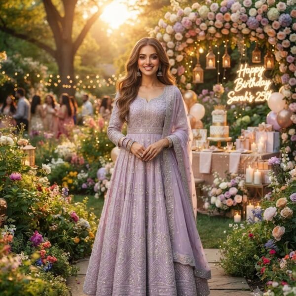
A 25-year-old woman wearing a lavender satin gown, smiling while holding a birthday cake in a beautifully decorated garden during golden hour, photographed using an 85mm portrait lens with a shallow depth of field.
Prompt Score
| Category |
Score |
| Subject |
⭐⭐ |
| Outfit |
⭐⭐ |
| Environment |
⭐⭐ |
| Lighting |
⭐⭐ |
| Camera |
⭐⭐ |
Total Score: 10 / 10
This prompt gives Gemini enough information to make consistent decisions about the portrait, reducing the amount of visual guesswork.
Why This Works
Think of every missing detail as a question Gemini has to answer on its own.
For example, if you don't mention lighting, the model decides the lighting.
If you don't mention the outfit, it decides the clothing.
If you don't specify the camera angle, it chooses one automatically.
The more important decisions you make inside the prompt, the more predictable and repeatable the final image becomes.
Why Certain Words Produce Better Images
These aren't magic words. They work because they map to real photography concepts the model has learned from millions of labeled images.
- Cinematic — pulls toward wide aspect ratios, dramatic shadow contrast, and color grading similar to film stills, rather than flat everyday lighting.
- Golden hour — a real, well-documented lighting condition (warm, low-angle sun). Using this term is more reliable than "warm lighting" because it's tied to a specific, consistent visual pattern.
- 85mm portrait lens — a lens focal length photographers use specifically for flattering facial proportions and background compression. Naming it tells the model to avoid wide-angle distortion.
- Shallow depth of field — pushes the background out of focus, which isolates the subject and reads as "professional" rather than "snapshot."
- Ultra realistic — a direct instruction away from illustration, cartoon, or painterly rendering styles.
- HDR — signals a wider dynamic range between shadows and highlights, useful for scenes with mixed lighting like fairy lights against a dusk sky.
- Soft lighting — reduces harsh shadow edges, generally more flattering for close-up portraits than direct or overhead light.
- Editorial photography — pulls toward the posed, intentional, magazine-style compositions rather than candid snapshot framing.
The pattern across all of these: specific, technical, photography-rooted language gives the model a narrower and more predictable target than broad aesthetic adjectives.
Prompt Improvement Examples
Example 1
- Poor: "Woman at her birthday party, pretty, happy"
- Better: "A woman in her 20s at her birthday party, wearing a pink dress, smiling, balloons in the background"
- Professional: "A woman in her mid-20s with soft curled hair, wearing a blush pink satin dress, genuine smile, celebrating her birthday on a decorated terrace with pastel balloons, golden hour lighting, shot on an 85mm lens, shallow depth of field, ultra realistic"
Why it improves: The poor version leaves age, outfit, setting, and lighting entirely up to the model. The better version adds outfit and setting but still has no lighting or camera direction. The professional version locks in every major variable, which is why it produces far more consistent results across regenerations.
Example 2
- Poor: "Birthday photo, luxury, gold, beautiful"
- Better: "A woman in a gold dress at a luxury birthday party with gold balloons"
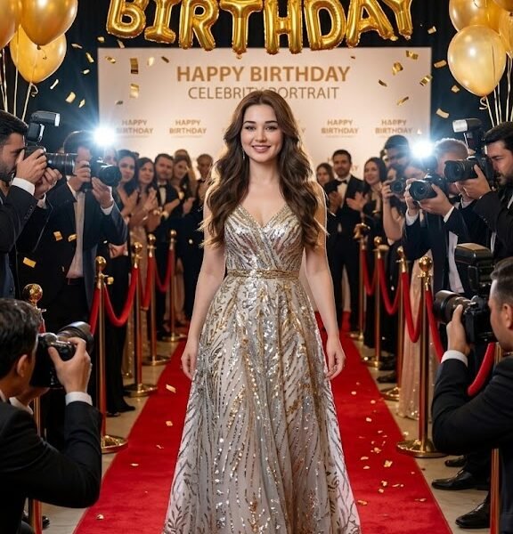
- Professional: "A woman in her 30s wearing a gold sequined gown, confident pose with one hand on hip, at an upscale birthday celebration with gold balloons and a small tiered cake, warm studio lighting, 50mm lens, close-up shot, cream and gold color palette, editorial photography style"
Why it improves: "Luxury" and "beautiful" are subjective words with no visual definition — the model has to invent what those mean. Naming the actual materials (sequins, gold balloons, tiered cake) and lighting style gives it something concrete to render instead.
Example 3
- Poor: "Fantasy birthday picture, magical, princess"
- Better: "A woman dressed as a princess for her birthday, magical background, castle"
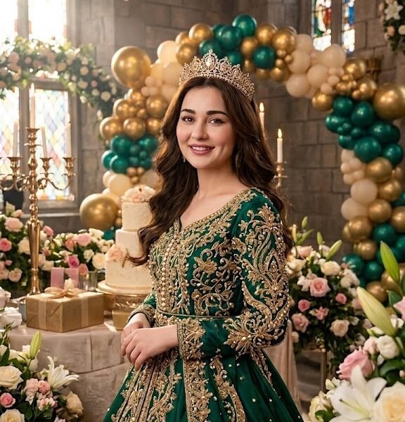
- Professional: "A woman in her late 20s wearing a flowing lavender ball gown with a delicate tiara, soft dreamy expression, celebrating her birthday in a candlelit castle courtyard, string lights overhead, soft golden lighting, 35mm lens, wide shot, pastel and lavender color palette, cinematic quality"
Why it improves: "Magical" alone gives no visual anchor. Naming the fabric, accessory, specific lighting source (candlelight plus string lights), and lens turns an abstract theme into an actual, renderable scene.
What Gemini Struggles With
Understanding what Gemini finds difficult is just as important as knowing which prompt techniques work well. While the model can produce impressive birthday portraits, there are certain situations where results become less predictable. Knowing these limitations helps you write cleaner prompts and spend less time regenerating images.
1. Long Text Inside Images
One of the most common issues is text rendering. Although Gemini has improved significantly, it can still struggle with long birthday messages, decorative fonts, or multiple lines of text.
Instead of requesting:
❌ "Happy 25th Birthday Sarah! Wishing You A Wonderful Day Full Of Happiness And Love."
Try:
✅ "A luxury birthday cake with a small gold 'Happy Birthday' topper."
If your design requires accurate wording, it's usually easier to add the final text afterward using an image editor.
2. Too Many Decorations
Adding every decoration you can think of often creates a cluttered composition.
Instead of listing:
- balloons
- confetti
- flowers
- candles
- fireworks
- gifts
- ribbons
- banners
- champagne
- fairy lights
- streamers
choose only two or three important elements.
A simpler scene allows Gemini to keep the woman as the main subject rather than dividing attention across dozens of objects.
3. Conflicting Art Styles
Gemini performs best when the artistic direction is consistent.
Avoid prompts such as:
Ultra realistic, anime, watercolor, Pixar, oil painting, cinematic photography.
These styles describe completely different visual goals.
Instead, choose one clear direction.
Examples:
- Ultra realistic portrait photography
- Anime illustration
- Watercolor artwork
- Cinematic fashion photography
Keeping a single artistic style usually produces more coherent images.
4. Multiple Main Subjects
Birthday portraits are generally strongest when the prompt focuses on one primary subject.
A prompt asking for:
- birthday woman
- husband
- three children
- grandparents
- pets
- friends
gives the model many competing priorities.
If your goal is a personal birthday portrait, make the birthday woman the clear focus and add supporting characters only when they contribute to the story.
5. Mixing Different Lighting Conditions
Lighting instructions should never compete with each other.
Avoid combinations like:
- Golden hour
- Studio lighting
- Neon lighting
- Candlelight
in the same prompt.
Instead, choose one dominant light source.
Examples:
- Soft golden hour
- Professional studio lighting
- Warm candlelight
- Natural window light
A single lighting style produces more consistent colors, shadows, and facial details.
6. Overloaded Prompts
Adding dozens of descriptive words doesn't always improve quality.
Many users believe longer prompts automatically create better images.
In reality, prompts become less focused when every sentence introduces another style, mood, decoration, or camera instruction.
Rather than writing one giant paragraph, prioritize the information that matters most:
- Subject
- Outfit
- Pose
- Background
- Lighting
- Camera
- Mood
A well-structured prompt is usually more effective than a very long one.
7. Unrealistic Physical Details
Extremely exaggerated requests can lead to distorted or unnatural results.
Examples include:
- impossible body proportions
- oversized accessories
- floating decorations without explanation
- impossible lighting directions
- contradictory clothing descriptions
Keeping descriptions physically believable generally produces more convincing portraits.
8. Too Many Quality Keywords
Words such as:
- Ultra realistic
- Hyper realistic
- 16K
- HDR
- Award winning
- Masterpiece
- Best quality
- Highly detailed
- Professional
are often repeated unnecessarily.
After a certain point, adding more quality keywords contributes very little.
Instead of repeating quality terms, spend that space describing:
- facial expression
- outfit fabric
- lighting
- background
- composition
These details usually have a greater influence on the final image.
Quick Summary
| Challenge |
Better Approach |
| Long text |
Keep text short or add it later |
| Too many decorations |
Use only 2–3 important props |
| Mixed art styles |
Choose one artistic direction |
| Multiple subjects |
Keep one clear main subject |
| Mixed lighting |
Use one dominant light source |
| Overloaded prompts |
Follow a logical prompt structure |
| Unrealistic requests |
Keep descriptions believable |
| Excessive quality keywords |
Describe the scene instead |
Birthday Style Guide
| Style |
Best mood |
Best colors |
Ideal outfit |
Best use case |
Difficulty |
| Luxury |
Confident, glamorous |
Gold, black, deep red |
Sequined gown, structured dress |
Milestone birthdays, upscale parties |
Medium |
| Princess |
Soft, whimsical |
Lavender, blush, white |
Ball gown, tiara |
Themed parties, younger birthdays |
Easy |
| Garden |
Natural, romantic |
Green, pastel florals |
Flowy sundress |
Outdoor daytime celebrations |
Easy |
| Beach |
Relaxed, breezy |
White, tan, ocean blue |
Linen dress, sun hat |
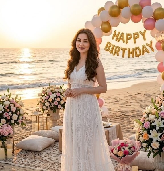
Summer or destination birthdays |
Easy |
| Minimalist |
Calm, clean |
White, beige, muted tones |
Simple tailored dress |
Modern, understated aesthetic |
Easy |
| Editorial |
Bold, intentional |
High contrast, monochrome |
Statement outfit |
Fashion-forward portraits |
Hard |
| Vintage |
Nostalgic, warm |
Sepia, muted red, cream |
Retro-cut dress |
Themed or era-specific parties |
Medium |
| Fantasy |
Dreamy, magical |
Purple, silver, jewel tones |
Elaborate gown, accessories |
Creative or fairytale themes |
Hard |
| Modern |
Sleek, fresh |
Black, white, metallics |
Contemporary fitted dress |
Everyday realistic birthday shots |
Medium |
| Studio |
Polished, professional |
Neutral backdrop tones |
Fashion-forward outfit |
Portrait-style, controlled lighting |
Medium |
How Color Changes Birthday Mood
Color does more work in a birthday portrait than most people consciously name when writing a prompt, but it's usually the first thing that feels "off" when a result doesn't match expectations. Pink birthday prompts tend to feel younger not because pink is inherently youthful, but because pastel tones are strongly associated with spring celebrations and children's parties across most visual media. Deep pink or magenta breaks that association and shifts the same color family toward a fashion-editorial feel instead of a playful one.
- Gold — signals celebration and luxury; pairs naturally with warm lighting and evening settings. Overusing it in both outfit and background can flatten the image, so it works best as either the outfit color or the lighting tone, not both at full intensity.
- Pink — reads as soft, youthful, and romantic; works well for daytime or pastel themes. Deeper pinks (magenta, fuchsia) push toward a bolder, more editorial feel than blush or baby pink.
- White — communicates clean elegance; needs strong lighting contrast or it can look washed out, especially against a bright background. Works best when paired with at least one deeper accent color in the scene.
- Black — creates drama and sophistication; best paired with a single bright accent color (gold, red, or silver) so the frame doesn't read as flat or somber, which black can trend toward without contrast.
- Purple — associated with fantasy and royalty; strong choice for princess or fantasy themes. Lighter lavender shades feel soft and dreamy, while deep violet reads as more formal and dramatic.
- Blue — calm and cool; less common for birthdays but effective for evening or beach themes. Pairing blue with warm lighting (rather than cool studio light) prevents the overall scene from feeling cold.
- Emerald — rich and bold; photographs well against gold or neutral backgrounds. It holds up better in close-up shots than pastel colors, which can look washed out at close range.
- Rose gold — a softer alternative to gold; works for both daytime and evening looks, and tends to photograph more evenly across different skin tones than bright gold.
- Pastel — light, airy, and youthful; pairs best with garden or spring-themed settings. Pastel palettes benefit from soft, diffused lighting — harsh direct light can wash the colors out almost entirely.
Why Golden Hour Hides Imperfections Better Than Midday Light
The reason golden hour gets recommended so often isn't tradition — it's angle. Low-angle sunlight wraps around the face instead of hitting it straight on, which softens under-eye shadows, smooths skin texture, and avoids the harsh top-down shadows you get from a midday sun or an overhead studio light. Direct overhead light does the opposite: it deepens shadows under the eyes, nose, and chin, which is exactly why "midday sun" is one of the least flattering lighting instructions you can give a portrait prompt.
Studio lighting flattens shadows too, but in a different way — through even, diffused light rather than angle. That's why studio shots read as "clean" but sometimes "flat," while golden hour reads as "warm" and "cinematic." Neither is objectively better; they solve different problems.
| Lighting type |
Best for |
Notes |
Editorial rating |
| Golden hour |
Outdoor, warm celebratory shots |
Naturally flattering skin tones, soft shadows |
★★★★★ |
| Studio |
Controlled, polished portraits |
Best when background needs to stay neutral |
★★★★☆ |
| Sunset |
Romantic or dramatic outdoor scenes |
Strong color gradient in the sky, use sparingly with busy backgrounds |
★★★★★ |
| Soft window light |
Indoor, natural-feeling portraits |
Gentle, even, good for close-ups |
★★★★☆ |
| Fairy lights |
Evening or intimate party scenes |
Best as an accent light, not the primary source |
★★★☆☆ |
| Neon |
Modern, editorial, nightlife themes |
High contrast, can clash with soft outfits |
★★★☆☆ |
| Candlelight |
Intimate, warm, vintage-feeling scenes |
Lower overall brightness, pairs with muted colors |
★★★★☆ |
| Cloudy daylight |
Even, soft, minimal-shadow portraits |
Great for minimalist or natural looks |
★★★★☆ |
Ratings above reflect editorial judgment on versatility and reliability across different outfit and setting combinations — not a measured test score. Your results will vary by subject, outfit, and setting.
Why 85mm Produces More Flattering Portraits Than 35mm
This comes straight from real lens physics, not AI-specific behavior. Wide lenses like 35mm exaggerate whatever is closest to the camera — noses and foreheads get slightly larger, and faces can look subtly distorted, especially in close-up shots. That distortion is why phone selfies (shot on a wide lens) often look different from a face in a proper portrait.
An 85mm lens compresses the image and keeps facial proportions closer to how they look in person. It also naturally produces background blur at wider apertures, which is why "85mm" and "shallow depth of field" so often appear together in portrait prompts — one causes the other in real photography, and naming both reinforces the same visual outcome.
- Portrait photography — the general framing style for face-and-shoulders or half-body shots; implies intentional posing.
- DSLR — signals realistic camera rendering over stylized or illustrated output.
- 85mm — flattering compression for close-up and half-body portraits; minimal distortion.
- 50mm — closer to natural human eye perspective; good for full-body or environmental shots.
- Close-up — face-focused framing; best when expression and detail matter most.
- Wide shot — shows the full scene and environment; good for showcasing decorations or setting.
- Full body — shows the outfit in complete detail; useful for fashion-forward looks.
- Low angle — shot from below, adds a sense of grandeur or confidence.
- Eye level — neutral, natural, most commonly flattering default.
- Over-the-shoulder — candid, editorial feel; good for showing both subject and background.
Practical example: For a luxury birthday portrait, "85mm lens, close-up, eye level" tends to produce a polished, magazine-style result. For a garden party scene where the setting matters, "50mm lens, wide shot" shows off both the subject and the decorated environment.
A few more combinations worth knowing: "low angle, full body" tends to add a sense of confidence and scale, useful for a dramatic entrance-style shot at a milestone birthday. "Over-the-shoulder, soft window light" works well for a more candid, editorial feel where you want the viewer to feel like they're catching a real moment rather than a posed shot. "Eye level, close-up" is the safest general-purpose combination when you're not sure what else to specify — it rarely produces an awkward or distorted result.
Customization Guide
To personalize a prompt without rewriting it from scratch, adjust these variables one at a time:
- Age — shifts styling, makeup intensity, and typical outfit choices
- Hair — length, texture, color, and styling (updo vs. loose)
- Dress — fabric, cut, and formality level
- Culture — traditional attire, specific cultural celebration elements
- Theme — luxury, garden, fantasy, minimalist, etc.
- Flowers — type and color, tied to season and mood
- Cake — size, style, and whether it should appear prominently
- Location — indoor/outdoor, specific venue type
- Pets — adds warmth and personality if relevant
- Accessories — jewelry, tiara, sash, sunglasses
- Birthday number — informs theme and age-appropriate styling
- Message — best kept minimal; text rendering is unreliable in most AI image tools
When personalizing, change no more than two or three of these variables at once if you already have a prompt that's working well. Swapping the dress color and the location together is usually safe. Swapping the outfit, the setting, the lighting, and the theme all at the same time is closer to writing a brand-new prompt, and you lose the benefit of building on something you know already works.
For culturally specific birthday portraits — a saree for a South Asian celebration, a qipao for a Lunar New Year birthday, a traditional gown for a quinceañera-style shoot — naming the exact garment matters far more than naming the culture in general terms. "Traditional Indian attire" is vague enough that the model has to guess which region, era, and style you mean. "Red and gold silk saree with traditional embroidery" gives it something concrete to render.
Real Prompt Testing
These are practical observations from testing the same base prompt with single variables changed — not formal benchmarks, just consistent patterns worth knowing.
Changing only lighting: Keeping subject, outfit, and setting identical and switching from "soft studio lighting" to "golden hour" noticeably shifted skin tone warmth and shadow softness. The golden hour version consistently read as more "celebratory," while the studio version read as more "posed and controlled."
Changing only camera: Switching from a wide shot to a close-up with an 85mm lens shifted focus almost entirely onto expression and outfit detail, with the background falling out of focus. The wide shot version gave much more visibility to decorations and setting, but expression became less prominent.
Changing only background: Swapping a plain studio backdrop for a decorated garden setting, with everything else identical, added visual complexity that sometimes competed with the subject. In these cases, adding "shallow depth of field" helped keep the subject as the visual priority even with a busier background.
Changing only outfit: With subject, pose, lighting, and setting held constant, swapping a matte cotton dress for a sequined or satin gown noticeably changed how the lighting interacted with the scene. Reflective fabrics like sequins and satin picked up highlights from the lighting source in ways that added visual sparkle, while matte fabrics kept the focus more evenly on the face and pose. This is worth knowing if you're chasing a specific "glam" versus "natural" feel — the fabric choice does real work here beyond just color.
Takeaway: Changing one variable at a time is far more useful for learning what each word does than rewriting the whole prompt after every unsatisfying result. It also builds an intuition over time for which words are load-bearing and which are decorative.
Our Practical Testing Observations
The following observations are based on repeated use of Google Gemini while refining birthday portrait prompts. They are not formal benchmark tests, but practical patterns that appeared consistently when changing one prompt variable at a time.
Lighting Had the Biggest Visual Impact
Among all prompt elements, lighting produced the most noticeable differences. Switching from studio lighting to golden hour often changed the overall mood, skin tone, and depth of the portrait far more than changing the outfit or decorations.
In general:
- Golden hour created warmer, softer portraits.
- Studio lighting produced cleaner and more controlled images.
- Soft window light worked well for natural indoor portraits.
- Sunset lighting added stronger color contrast but could become overly dramatic when combined with bright clothing.
Camera Instructions Improved Composition
Adding photography terms such as 85mm portrait lens, 50mm lens, or shallow depth of field usually resulted in more professional-looking compositions.
When camera instructions were omitted, Gemini more frequently generated generic mid-distance portraits with less background separation.
Detailed Subjects Reduced Variation
Portraits became noticeably more consistent when the subject description included details such as:
- approximate age
- hairstyle
- hair color
- facial expression
- outfit
Short descriptions like "birthday woman" produced greater variation between generations than more descriptive prompts.
Simpler Scenes Produced Cleaner Results
Adding too many decorations often reduced the overall quality of the portrait.
Prompts that focused on only one or two decorative elements—such as balloons and a birthday cake—generally kept the attention on the subject instead of the background.
Changing One Variable Was More Effective Than Rewriting Everything
One of the most useful techniques during testing was modifying only a single element between generations.
For example:
- changing only the lighting
- changing only the dress color
- changing only the background
- changing only the camera angle
made it much easier to understand which words were responsible for improvements. Rewriting an entire prompt after every generation often introduced several new variables at once, making it difficult to identify what actually influenced the result.
If a generated birthday portrait doesn't look the way you expected, avoid rewriting the entire prompt. Instead, keep the prompt structure the same and adjust only one variable at a time. This approach makes prompt refinement faster, produces more predictable results, and helps build prompts that can be reused for future birthday portraits.
PromptTick Tip
When a prompt already produces a good composition, treat it as a reusable template. Instead of writing a completely new prompt for every birthday theme, simply replace elements such as the outfit, color palette, decorations, or location while keeping the overall structure the same. This usually produces more consistent results than starting from scratch each time.
Before You Generate
Run through this before submitting your prompt:
- Is the subject description specific enough to be consistent across regenerations?
- Does the outfit match the setting and formality level?
- Is there exactly one clear lighting instruction?
- Have you picked one camera/lens style rather than several conflicting ones?
- Are decorations limited to 1-2 elements instead of a cluttered list?
- Does the color palette tie outfit, lighting, and decorations together?
- Have you removed conflicting style words (e.g., vintage + ultra modern)?
- Is any requested text (birthday number, banner) kept minimal?
Quick Prompt Checklist
- Subject (age, build, hair)
- Outfit (fabric, color, formality)
- Background (setting, environment)
- Lighting (one clear type)
- Camera (lens, framing, angle)
- Mood (expression, pose, energy)
- Color (palette tying the scene together)
- Quality keywords (realism, detail level)
Score Your Own Prompt (1–10)
Before you generate, rate your prompt honestly against these five factors. This isn't a formula Gemini uses internally — it's a way to catch weak spots before you spend a generation on them.
| Factor |
2 points if... |
| Subject clarity |
Age, hair, and build are all specified, not left implied |
| Lighting |
Exactly one clear lighting condition is named |
| Camera |
Lens type and framing (close-up, wide, full body) are both specified |
| Environment |
Setting is concrete, not generic ("party" vs. "rooftop terrace at dusk") |
| Composition |
Pose and expression are specific, not just "smiling" or "posing" |
A prompt scoring 8-10 usually needs no more than one or two regenerations to get a usable result. A prompt scoring below 6 will often need several attempts, because there are still multiple details the model has to guess on its own.
Fabric and Light: Why Sequins Photograph Differently Than Cotton
This is real material science, not an AI quirk. Reflective fabrics — sequins, satin, silk — bounce light directly back toward the camera, which is why they pick up sparkle and highlight detail under golden hour or fairy lights. Matte fabrics — cotton, linen, most sundress materials — absorb more light and scatter it evenly, which keeps the focus on skin and expression rather than the fabric itself.
This is why a "sequined gown" prompt paired with strong directional lighting (golden hour, candlelight) tends to produce a more dramatic, sparkle-heavy result, while the same lighting on a "linen sundress" produces a softer, calmer image. If you want the outfit to be the visual centerpiece, pair reflective fabric with directional light. If you want the face and expression to lead, pair matte fabric with soft, diffused light.
Choosing the Right Aspect Ratio for Where You'll Post It
This is one of the most commonly skipped details, and it has nothing to do with the prompt's subject matter. Portrait-oriented compositions (roughly 4:5) generally fit Instagram feed posts better without awkward cropping, while a taller composition (9:16) is better suited for Stories, Reels, and WhatsApp Status. A wide shot composed for a landscape frame will often get cropped in ways that cut off exactly the outfit or decoration detail you asked for, if you post it somewhere that expects a vertical frame. Deciding where the image will actually be posted before generating it saves a regeneration later.
FAQ
Does Gemini need special formatting for prompts, like brackets or tags?
No. Gemini reads natural language prompts. Overly technical formatting (brackets, weighted syntax used in some other tools) isn't necessary and can sometimes confuse plain-language interpretation.
Why does my subject's face change slightly between regenerations?
This is normal for most AI image generators. Locking in more specific facial and hair details (exact hair color, length, and style) reduces variation, but some drift between generations is expected.
Can I get the same "character" across multiple birthday photos?
Consistency improves with very specific, repeated descriptive language across prompts, but exact character consistency across separate generations isn't guaranteed with this workflow.
Why do my prompts with lots of decorations look cluttered?
Every object you name competes for visual space and detail. Limiting decorations to 1-2 named elements keeps the subject as the clear focal point.
Is it better to write one long prompt or several short ones?
One well-organized prompt in a logical order (subject → outfit → pose → setting → lighting → camera) tends to outperform a long unstructured list of adjectives.
Why does my birthday number or text on a cake come out wrong?
Rendering accurate text is a known weak point across most current AI image tools, not specific to birthday prompts. Keep text minimal or plan to edit it separately.
What's the difference between "cinematic" and "editorial" styles in a prompt?
Cinematic tends to pull toward dramatic lighting and film-like color grading. Editorial tends to pull toward intentional, posed, magazine-style composition. They can overlap but aren't identical.
Should I include camera brand names like Canon or Nikon?
Lens and shot type (85mm, shallow depth of field) tend to have more consistent influence than specific camera brand names.
Why does my golden hour prompt sometimes look orange instead of warm?
This usually happens when golden hour is combined with other strong color instructions that conflict. Simplifying the color palette alongside the lighting instruction usually balances it out.
Can I combine two style categories, like luxury and garden?
Yes, but pick one as primary and one as an accent rather than giving them equal weight, or the model may blend them into something less coherent than either style alone.
Why does close-up framing sometimes cut off the outfit I described in detail?
If outfit detail matters most, use a wider framing instruction (full body or wide shot) instead of close-up, which naturally crops out most of the outfit.
Do I need to specify ethnicity for realistic results?
Only if it matters to you for the specific portrait — leaving it unspecified means the model will default to whatever is statistically common in its training data, which may not match your intent. If accuracy matters, describing specific features (skin tone, hair texture) alongside ethnicity tends to produce more consistent results than the ethnicity label alone.
Why do two prompts that look almost identical produce very different photos?
Small wording changes can shift emphasis more than expected. "Bright smile" versus "soft smile" changes the entire emotional tone of a face, and "standing near a cake" versus "leaning over a cake, blowing out candles" changes the whole pose. Read your prompt back and ask which words are doing the most emotional or physical work — those are usually the ones causing the difference.
Why does adding "ultra realistic" sometimes make the image look worse?
It's a strong instruction, but it works best when paired with concrete photographic terms (lens, lighting). Alone, it can push toward an uncanny middle ground between photo and render.
What's the most overlooked part of a birthday prompt?
Pose and expression. Most people focus heavily on outfit and setting but leave expression as just "smiling," which limits how expressive and natural the final image feels.
Is it worth regenerating multiple times with the same prompt
Yes — even a strong, specific prompt has some variation between generations. Comparing 2-3 outputs from the same prompt often reveals which random variation best matches what you had in mind.
Final Tips
Write your prompt in the order a photographer would actually think, not the order ideas pop into your head. Subject, outfit, pose, setting, lighting, camera — in that sequence.
Change one variable at a time when something isn't working. Rewriting the whole prompt from scratch after a bad result makes it harder to learn what actually caused the problem.
Pick one lighting condition and commit to it. Mixing golden hour with studio lighting in the same prompt is one of the most common reasons results look inconsistent.
Keep decorations minimal. Two well-chosen elements will consistently outperform a crowded list of five or six.
Save your best-performing prompts and treat them as templates. Swapping the outfit, color palette, or setting on a prompt structure you already know works is far more reliable than starting from zero every time.