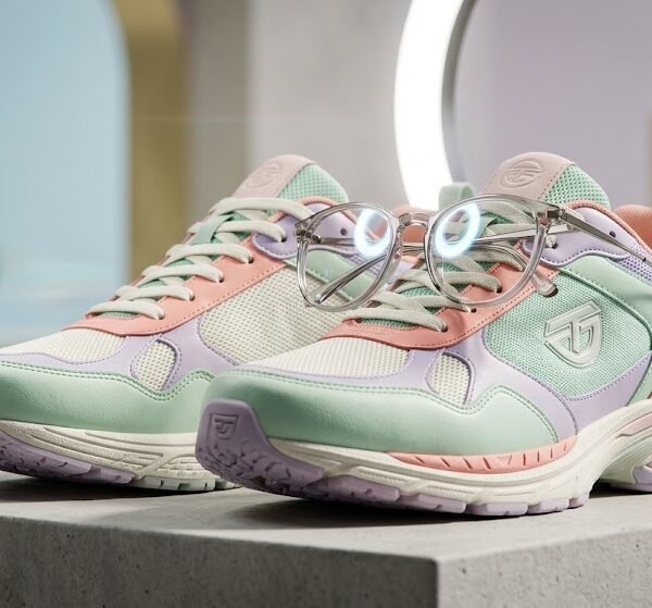
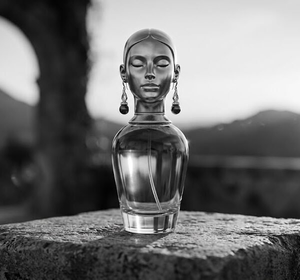
What Makes a Great Product Photography Prompt?
A product photography prompt only works if it solves one problem: telling Gemini exactly what the product is before anything else gets a chance to confuse it. Most weak prompts fail here. They open with mood or style, and by the time the product description shows up, the model has already committed to a visual direction that doesn't match the item.
Here's what actually separates a prompt that produces a usable commercial image from one that produces a generic render.
Product clarity. Name the product with its real shape, size class, and function — "a matte ceramic pour-over coffee dripper," not "a coffee item." Vague nouns force the model to guess, and it will guess toward whatever it has seen most often in training, which is rarely your product.
Surface and backdrop. The surface a product sits on does more work than most people expect. A glass surface introduces reflections you didn't ask for. A linen surface adds texture noise around the product edges. If you don't specify the surface, Gemini defaults to whatever surface most commonly appears with that lighting style — often a plain table, which reads as cheap in a luxury context.
Material and texture. "Leather bag" and "pebbled leather bag with visible grain" produce different light behavior. Materials don't just look different — they reflect differently. Matte materials absorb light and reduce highlight bloom. Glossy materials create hard reflections that can either look premium or distracting depending on how they're lit.
Lighting. This is the single highest-leverage variable in the entire prompt. Lighting decides shadow direction, highlight placement, and whether the product looks flat or dimensional. A prompt with perfect product description but no lighting instruction will still produce inconsistent results across generations.
Camera language. Words like "50mm lens," "macro," or "eye-level shot" aren't decoration — they tell the model how much of the frame the product should occupy and how compressed the background should look. Skip this and you get an arbitrary framing choice.
Styling and props. Props should support the product, not compete with it. One or two supporting objects (a spoon next to a jar, a leaf beside a bottle) add context. Five props scattered around the frame dilute focus and often confuse the model about what the "main subject" actually is.
Reflections and shadows. These are the details that make an image feel photographed rather than rendered. A soft contact shadow under the product anchors it to the surface. No shadow at all is a strong tell that an image was AI-generated or poorly composited.
Composition. Where the product sits in the frame — centered, off to one side following the rule of thirds, tight crop — changes the entire feel of the image. E-commerce listings usually want centered, symmetrical composition. Editorial and lifestyle images benefit from asymmetry.
None of these elements work in isolation. A prompt that nails lighting but ignores surface will still look wrong, because the two interact — matte surfaces need more directional light, glossy surfaces need diffused light to avoid harsh reflections.
How Gemini Interprets Product Photography Prompts
Gemini doesn't read a prompt as a flat list of instructions. In practical use, it appears to weight information based on where it sits in the prompt and how specific it is. Understanding this ordering helps you write prompts that actually get followed, instead of prompts that sound thorough but get partially ignored.
Product first, always. In many cases, whatever comes first in the prompt gets treated as the anchor for everything else. If you lead with "cinematic lighting" and mention the product third, the model may prioritize the mood over correctly rendering the product's actual shape and details. Leading with the product name and its defining features locks that in before style instructions start influencing the output.
Material before surroundings. Based on practical use, describing what the product is made of before describing what surrounds it tends to produce more accurate surface rendering. If the backdrop is described first, the model seems to sometimes carry backdrop material qualities (like glass reflectivity) onto the product itself.
Lighting before background. Lighting instructions placed before background description generally produce backgrounds that look lit consistently with the product. When background comes first, you sometimes get a background that looks like it belongs to a different lighting setup than the product does — a mismatch that's subtle but noticeable.
Realistic, concrete wording beats abstract mood words. Terms like "beautiful" or "amazing" don't map to any specific visual instruction, so the model has to invent what that means. Concrete terms — "soft diffused sidelight," "warm color temperature," "shallow depth of field" — map to identifiable visual patterns the model can act on directly.
Avoid conflicting styles. Asking for "minimalist" and "maximalist props" in the same prompt, or "moody dark lighting" alongside "bright airy studio," creates competing instructions. The model has to resolve the conflict somehow, and the resolution is rarely what you wanted. When style words contradict each other, pick one and commit.
Logical grouping matters more than prompt length. A long prompt with instructions scattered out of order performs worse than a shorter prompt that's logically sequenced: product → material → surface → lighting → camera → mood → quality tags. This ordering roughly follows how a real photographer would set up a shoot — subject first, then physical setup, then technical capture settings.
How Professional Product Photographers Think
Before a photographer touches a camera, they're not thinking about words like "cinematic" or "beautiful." Those are the last decisions, not the first. A working photographer runs through a mental checklist that has almost nothing to do with mood and everything to do with function.
1. What is the product? Not just its name — its shape, its material, and what makes it fragile to shoot (reflective? transparent? oddly shaped?).
2. What needs to be shown? A watch needs its face and strap detail visible. A skincare jar needs its lid and label legible. Every product has one or two details that actually sell it, and the shot has to protect those details.
3. Who is the customer? A luxury buyer expects restraint and negative space. An Amazon shopper expects clarity and a plain background. The same product photographed for these two audiences should look different, on purpose.
4. What lighting supports that goal? Only now does lighting get decided — and it's decided based on the previous three answers, not personal taste. A jewelry piece built for close inspection needs different lighting than a lifestyle mood shot.
5. Which angle shows the product best? Angle is chosen to protect whatever was flagged as important in step 2. If the lid matters, the angle needs to show the lid.
6. What should be removed from the frame? Professionals spend as much time deciding what not to include — extra props, distracting reflections, clutter — as they do deciding what to add.
Notice that "mood" and "style" show up last, not first. That order matters.
The best AI prompts follow the same sequence. Instead of opening with adjectives, think like a photographer planning a shoot: identify the product and what it needs to show, consider who's going to look at this image and why, then let lighting and angle serve that goal. Every clause in your prompt should answer one practical question before moving to the next — not add another mood word to a pile that's already there.
Prompt Anatomy
Break any solid product photography prompt into its working parts, and you'll see the same skeleton every time. Here's one example, dissected piece by piece:
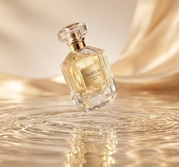
"A tall amber glass perfume bottle with a brushed gold cap, placed on a polished black marble surface, shot from a slightly elevated 45-degree angle, styled with a single sprig of dried lavender beside it, lit with soft studio softbox lighting from the left, subtle reflection on the marble, soft shadow beneath the bottle, dark neutral background, warm color palette, ultra-realistic, high detail, commercial product photography."
| Component |
What it contributes |
| Product ("amber glass perfume bottle, brushed gold cap") |
Locks the model onto the correct subject, material, and color before anything else is decided |
| Material/Texture ("glass," "brushed gold") |
Tells the model how light should behave on the surface — glass refracts, brushed metal diffuses highlights |
| Surface/Backdrop ("polished black marble") |
Sets the reflection behavior and contrast level of the base the product sits on |
| Angle ("elevated 45-degree angle") |
Determines how much of the product's top and side are visible — critical for bottles, jars, and packaging |
| Props ("dried lavender sprig") |
Adds context and scale without competing with the product for attention |
| Lighting ("soft studio softbox lighting from the left") |
Controls shadow direction, highlight placement, and overall mood |
| Camera (implied through angle and framing language) |
Establishes how "photographic" versus "illustrated" the final image feels |
| Reflections/Shadows ("subtle reflection," "soft shadow beneath") |
Anchors the product physically in the scene — without these, images look like flat cutouts |
| Background ("dark neutral background") |
Keeps focus on the product and sets overall contrast |
| Color palette ("warm color palette") |
Ties every element — product, surface, lighting — into one consistent tone |
| Quality keywords ("ultra-realistic," "high detail," "commercial product photography") |
Signals the rendering style and level of finish expected |
Notice that each component answers a specific question a real photographer would ask before a shoot: What am I shooting? What's it made of? What's it sitting on? Where's the light coming from? What's the mood? Strip any one of these out and the image has to guess the missing answer.
Prompt Formula
Once you understand the anatomy, you can build a repeatable formula instead of starting from scratch every time.
The formula:
[Product + defining material/color] + [placed on/in Surface/Backdrop] + [Angle/Camera framing] + [Props, if any] + [Lighting style and direction] + [Reflections/Shadow description] + [Background] + [Color palette/mood] + [Quality keywords]
What each placeholder means:
- Product + defining material/color — the noun phrase that anchors everything. Include the one or two details that matter most (size, finish, color).
- Surface/Backdrop — the physical base and what's behind the product. Be specific about material, not just color.
- Angle/Camera framing — top-down, eye-level, 45-degree, macro close-up, wide shot. Pick based on what the product needs to show.
- Props — optional, but if included, keep it to one or two objects that support the story.
- Lighting style and direction — name the lighting type (softbox, natural window light, golden hour) and where it's coming from.
- Reflections/Shadow description — even a short phrase like "subtle shadow beneath" changes how grounded the image feels.
- Background — separate from surface; this is what's behind/around the product in the frame.
- Color palette/mood — one unifying tone word (warm, cool, moody, bright, pastel).
- Quality keywords — "ultra-realistic," "commercial photography," "high detail," "8k" if you want a sharper finish.
Fill in each slot in order and you'll rarely produce a broken prompt, because the sequence itself mirrors how the model appears to prioritize information.
Why Certain Words Produce Better Images
Some words carry more visual instruction per syllable than others. Here's why the common high-performing terms actually work:
Cinematic — signals wide dynamic range, deliberate shadow play, and a slightly desaturated or graded color tone. It pulls the output away from flat, evenly lit product shots toward something with more contrast and mood.
Studio lighting — tells the model to remove ambient/environmental light sources and simulate a controlled setup, usually with soft, even illumination and minimal harsh shadows. Good for clean e-commerce shots.
Macro lens — implies extreme close-up focus with shallow depth of field, exaggerated texture detail, and a blurred background. Use this when texture (fabric weave, condensation on glass, wood grain) is the selling point.
Shallow depth of field — blurs the background while keeping the product sharp, which visually separates subject from environment. This single phrase does more for perceived "professional" quality than almost any other term.
Ultra-realistic — pushes the output away from illustrative or stylized rendering and toward photographic texture, lighting behavior, and proportion accuracy.
HDR — increases the visible detail range between highlights and shadows, useful for products with both reflective and matte elements (like a metal-and-leather watch).
Softbox lighting — a specific studio lighting method that diffuses light through a fabric panel, producing soft-edged shadows and even coverage. This is the workhorse term for clean, commercial-looking product shots.
Editorial product photography — signals a more stylized, magazine-style composition with intentional negative space, asymmetry, and mood-driven color grading, as opposed to the flat, centered e-commerce look.
Each of these words works because it maps to a real, physical photography concept — not because it's a "magic keyword." If you understand what the term means on an actual photo set, you'll know exactly when to reach for it.
Prompt Improvement Examples
Example 1 — Skincare jar
- Poor: "A skincare jar on a table, nice lighting."
- Better: "A white ceramic skincare jar with gold lid, on a beige stone surface, soft natural lighting."
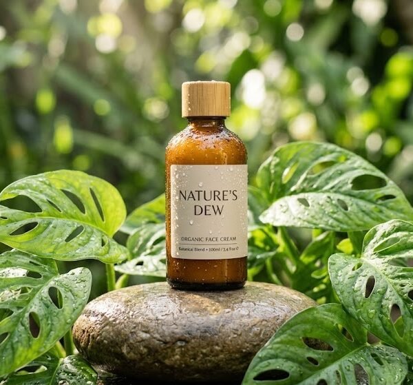
- Professional: "A matte white ceramic skincare jar with a brushed gold lid, placed on a warm beige textured stone surface, shot at eye level, softly diffused natural window light from the right, subtle shadow beneath the jar, minimal background, warm neutral color palette, ultra-realistic, commercial product photography."
Why it improves: the poor version gives the model almost nothing to anchor on — "nice lighting" isn't a lighting instruction. The better version adds material and light direction but skips angle and shadow, which is why the professional version still reads as more grounded and photographed.
Example 2 — Sneaker
- Poor: "Cool sneaker photo, dramatic."
- Better: "A black and white sneaker on a dark background, dramatic lighting, side angle."
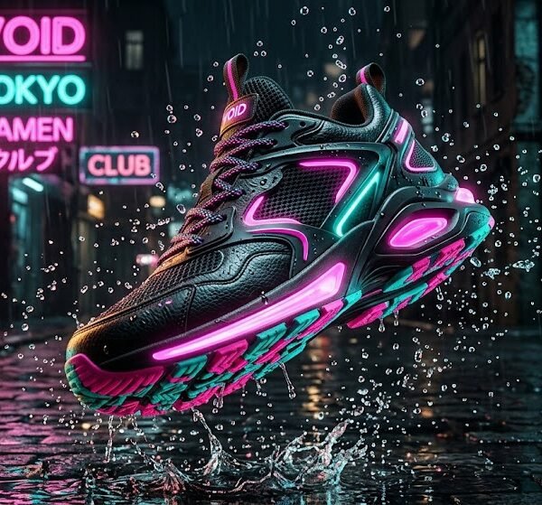
- Professional: "A black and white leather sneaker with visible stitching detail, positioned at a low side angle on a dark concrete surface, backlit with a single hard light source creating rim light along the edges, deep shadow beneath, dark moody background, high contrast, ultra-realistic, editorial product photography."
Why it improves: "dramatic" alone is ambiguous — dramatic could mean color, lighting, or angle. Naming the actual lighting technique (backlight, rim light, hard light source) tells the model precisely what "dramatic" should look like here.
Example 3 — Beverage bottle
- Poor: "Drink bottle, summer vibes."
- Better: "A glass beverage bottle with condensation, outdoor setting, bright sunny light."
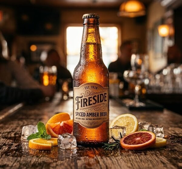
- Professional: "A clear glass beverage bottle beaded with condensation, placed on a wooden picnic table outdoors, shot at a slightly elevated angle, golden hour sunlight from behind creating a warm rim glow, soft natural shadow, blurred green foliage background, warm summery color palette, shallow depth of field, ultra-realistic."
Why it improves: "summer vibes" is a feeling, not an instruction. Golden hour, condensation, and a blurred foliage background are the actual visual ingredients that create that feeling — naming them directly is what gets them into the image.
Common Prompt Mistakes
Too many adjectives. Stacking five mood words ("stunning, gorgeous, breathtaking, luxurious, premium") doesn't add instruction — it adds noise. The model can't act on adjectives that don't map to a visual property. Pick one mood word and support it with concrete lighting/material terms instead.
Conflicting styles. Asking for "minimalist" and "ornate vintage props" together forces the model to average two contradictory aesthetics, usually producing a muddled result that satisfies neither.
Missing lighting instruction. Without lighting specified, results become inconsistent between generations — sometimes flat, sometimes harshly lit, sometimes inconsistent with the described mood.
Missing surface/backdrop. Leaving this out means the model defaults to the most statistically common surface for that product type, which is often generic and doesn't match your brand.
Unclear product focus. If the prompt spends more words on props and mood than on the product itself, the model may under-prioritize product accuracy — the exact opposite of what a product photo needs.
Poor composition instructions. Not specifying angle or framing leaves crop and placement to chance, which matters a lot for e-commerce images that need consistent framing across a whole catalog.
Asking for too much text or logos. Text rendering and logo accuracy remain weak points for AI image generation generally. Prompts that rely on visible readable text or precise brand logos often produce distorted or illegible results — better to add text/logo overlays afterward in editing software.
What AI Product Photography Still Struggles With
Some products are just harder for AI image generation to handle correctly, regardless of how well the prompt is written. Knowing these limits ahead of time saves a lot of wasted regenerations.
Transparent glass. Refraction is genuinely difficult — the model has to simulate how light bends through the material and how the background shows through it. Expect occasional warping or an oddly opaque patch where the glass should be see-through.
Mirrors. A true mirror reflection has to logically show whatever is in front of it, which the model isn't reliably tracking. Mirror surfaces often render as a vague, blurred approximation of a reflection rather than an accurate one.
Chrome and high-gloss metal. Chrome reflects its entire environment, which means the model has to invent a plausible surrounding scene to reflect — inconsistently. Chrome products often come out with reflections that look "close enough" but not physically accurate.
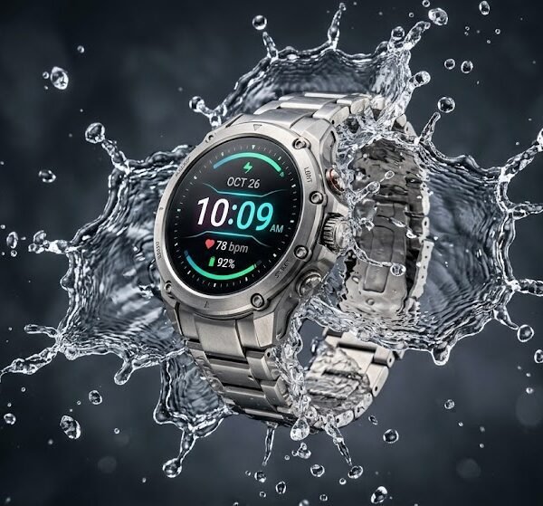
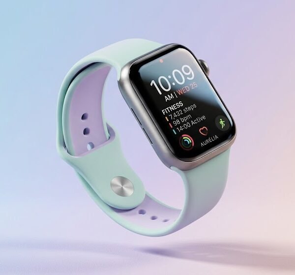
Watches. Small dials, thin hands, and tiny numerals are exactly the kind of fine detail that AI image models tend to blur or slightly misplace. Straps and casing usually render fine; the face is where problems show up.
Jewelry. Similar issue to watches — tiny facets, prongs, and engraved detail are hard to keep sharp, especially in close-up shots where every imperfection is visible.
Folded clothing. Fabric folds require the model to track consistent lighting and shadow across a complex, irregular surface. Folds sometimes look slightly "melted" or lose their crisp edges, especially with patterned fabric.
Liquids. Pouring liquid, splashes, or partially-filled transparent containers are difficult because the model needs to render both the liquid's surface behavior and how light passes through it simultaneously. Static, fully-contained liquids render far more reliably than motion shots.
Multiple products in one frame. The more products you ask for in a single image, the more likely one of them ends up distorted, duplicated, or inconsistent in scale relative to the others. Two products is usually manageable; five rarely comes out clean.
Packaging text. As mentioned earlier, readable text and precise logos remain one of the weakest areas of AI image generation. Expect garbled or approximate lettering on any packaging — plan to add real text in post-production rather than relying on the prompt.
Knowing which of these apply to your product ahead of time changes how you shoot it. If you're generating a chrome watch, for example, it's often more efficient to generate several variations and pick the cleanest one than to try to prompt-engineer your way to a perfect reflection.
Product Photography Style Guide
| Style |
Best Mood |
Best Colors |
Ideal Surface/Backdrop |
Best Use Case |
Difficulty |
| Luxury |
Refined, exclusive |
Black, gold, deep jewel tones |
Polished marble, dark stone |
High-end retail, jewelry, fragrance |
Medium-High |
| Minimalist |
Calm, clean |
White, beige, soft gray |
Plain white or muted matte surface |
E-commerce catalogs, tech products |
Low |
| Flat Lay |
Organized, editorial |
Depends on product theme |
Textured paper, fabric, wood |
Social media, cosmetics, stationery |
Low-Medium |
| Lifestyle |
Warm, relatable |
Natural, earthy, sunlit tones |
Real environments (kitchen, outdoors) |
Food, wellness, apparel |
Medium |
| Studio White Background |
Neutral, functional |
White with product's true colors |
Seamless white backdrop |
Amazon/e-commerce listings |
Low |
| Editorial |
Bold, artistic |
High contrast, saturated or moody |
Unconventional surfaces, negative space |
Fashion, magazines, campaigns |
High |
| Vintage |
Nostalgic, warm |
Sepia, muted earth tones |
Aged wood, worn fabric |
Heritage brands, vintage goods |
Medium |
| Outdoor/Natural |
Fresh, organic |
Greens, natural light tones |
Grass, stone, wood outdoors |
Skincare, beverages, outdoor gear |
Medium |
| Modern |
Sleek, confident |
Monochrome with accent color |
Glossy or matte geometric surfaces |
Tech, home goods |
Medium |
| E-commerce |
Clear, straightforward |
True-to-product colors |
Plain white/light gray |
Online marketplaces |
Low |
Color Psychology for Product Photography
Gold signals premium value and tradition. Works well for beauty, fragrance, and heritage brands, but overusing it can tip into looking dated if not balanced with a clean surface.
Black communicates confidence and exclusivity. It also increases perceived contrast, making product edges and reflections stand out more sharply — useful for tech and luxury goods.
White reads as clean, trustworthy, and neutral. It's the safest background choice for e-commerce because it puts all visual attention on the product itself.
Beige/Neutral feels warm without being loud. It's become the dominant tone for modern skincare and wellness branding because it suggests "natural" without literally using green.
Pastel softens a product's presence and suggests gentleness — common in baby products, cosmetics, and anything targeting a calm, approachable feel.
Emerald carries associations of richness and nature simultaneously. It pairs well with gold accents for a luxury-organic hybrid look.
Rose Gold blends warmth with a modern, slightly feminine-coded softness — frequently used in beauty and lifestyle tech.
Navy feels trustworthy and grounded, often used where a brand wants to feel established rather than trendy.
Earth Tones (terracotta, clay, olive) suggest sustainability and craftsmanship — a strong fit for artisanal or eco-conscious products.
Lighting Guide
| Lighting Type |
When It Works Best |
| Studio Softbox |
Clean, even e-commerce shots where you need minimal harsh shadow and true color accuracy |
| Natural Window Light |
Soft, believable lifestyle shots — especially skincare, food, and apparel |
| Golden Hour |
Warm, emotional outdoor shots — beverages, seasonal campaigns, lifestyle content |
| Ring Light |
Small products needing even, shadow-minimal illumination — jewelry, cosmetics close-ups |
| Backlighting |
Creating rim light and silhouette drama — good for glass, translucent, or edge-defined products |
| Diffused Overhead |
Flat lay compositions where even top-down light avoids uneven shadow across multiple objects |
| Reflector Fill |
Softening harsh shadows on one side without fully flattening the lighting — good middle-ground control |
| Cloudy Daylight |
Soft, shadow-minimal outdoor lighting, useful when you want natural light without harsh contrast |
Camera Guide
Product photography framing basics: the camera language you choose changes not just the look, but which product details actually get shown.
- DSLR-style / standard commercial framing — balanced, natural perspective, minimal distortion. Default choice for most catalog shots.
- Macro — extreme close-up, ideal for texture-driven products (fabric, food, jewelry detail).
- 50mm — mimics natural human eye perspective, minimal distortion, a safe default for most single-product shots.
- Close-up — fills the frame with the product, useful when detail matters more than context.
- Wide shot — includes more environment/context, good for lifestyle scenes where setting matters as much as product.
- Flat lay overhead — top-down view, ideal for multiple related products or items with a strong top profile (skincare sets, stationery, food).
- Low angle — shooting slightly from below makes a product look larger, more imposing — works for footwear, bottles, statement pieces.
- Eye level — neutral, straightforward, the standard for most e-commerce product shots.
- 45-degree angle — shows both the top and front of a product, common for bottles, jars, and boxes where both faces matter.
Practical example: a skincare bottle shot at eye-level with a plain background reads as clinical and clean — good for a pharmacy-style brand. The same bottle shot at a low angle with warm backlighting reads as premium and aspirational. Same product, completely different market position, purely from camera choice.
Customization Guide
Once you have a working prompt formula, personalizing it for different needs is mostly a matter of swapping specific slots:
- Product type — swap the noun and its defining feature (bottle → jar → box → garment)
- Material — glass, ceramic, matte plastic, brushed metal, leather, fabric
- Backdrop — marble, wood, fabric, concrete, plain seamless paper
- Props — keep to 1–2 relevant objects tied to product use (coffee beans near a mug, not random unrelated items)
- Theme — luxury, minimalist, seasonal, playful
- Color scheme — pick one dominant tone and one accent, not four competing colors
- Packaging — box, pouch, bottle, jar — describe finish (matte/glossy) since it affects light behavior
- Location/setting — studio vs. outdoor vs. lifestyle interior
- Brand style — match lighting and color mood to how the brand already presents itself elsewhere
- Accessories — small supporting items that hint at use-case without cluttering the frame
- Season — adjust color temperature and props (warm golden tones for autumn, cool bright tones for summer)
- Message/branding text — best added in post-production rather than requested directly in the prompt, since AI text rendering is still unreliable
Match the Prompt to the Platform
The same product often needs a genuinely different prompt depending on where the image is going to live. A shot built for Amazon will underperform on Instagram, and a shot built for Instagram will get flagged or look out of place on Amazon. Platform expectations aren't a style preference — for marketplaces like Amazon, they're closer to a requirement.
| Platform |
Best Style |
Background |
Camera |
| Amazon |
Studio white background |
Plain white, no props |
Eye level, centered |
| Shopify |
Lifestyle |
Natural setting/texture |
50mm, slightly elevated |
| Instagram |
Editorial |
Colorful or styled backdrop |
Close-up, creative angle |
| Pinterest |
Bright, aspirational |
Minimal, airy |
Flat lay |
| Facebook Ads |
High contrast |
Clean, simple |
Product centered |
| Luxury/Brand site |
Editorial or dark-luxury |
Dark stone, negative space |
45-degree or low angle |
The pattern underneath this table: marketplace platforms (Amazon, Facebook Ads) reward clarity and speed of recognition — a shopper scrolling fast needs to understand the product in half a second. Social and brand platforms (Instagram, Pinterest, luxury sites) reward mood and story, because the audience is browsing for inspiration rather than comparing listings. Write your prompt around which of those two modes your audience is in.
Product Categories Need Different Prompt Styles
Beyond platform, the product category itself changes what the prompt needs to prioritize. A formula that works well for one category can actively hurt another.
Food — needs steam, condensation, or visible freshness cues, plus close, macro-leaning framing that shows texture (crumb, glaze, char marks). Flat, distant shots make food look unappetizing regardless of lighting quality.
Jewelry — needs macro framing, a dark or black background for contrast, and explicit reflection/sparkle instructions. Without naming reflections directly, jewelry often renders flat and dull, which defeats the entire point of photographing it.
Perfume/Fragrance — needs glass material called out explicitly, warm or luxury-style lighting, and a marble or polished surface. This category leans hardest on reflections and light refraction, since the bottle itself is usually the entire selling point.
Shoes — needs a low angle to make the product feel substantial, and explicit texture callouts (leather grain, mesh weave, sole tread) since texture is a major part of how buyers judge footwear quality.
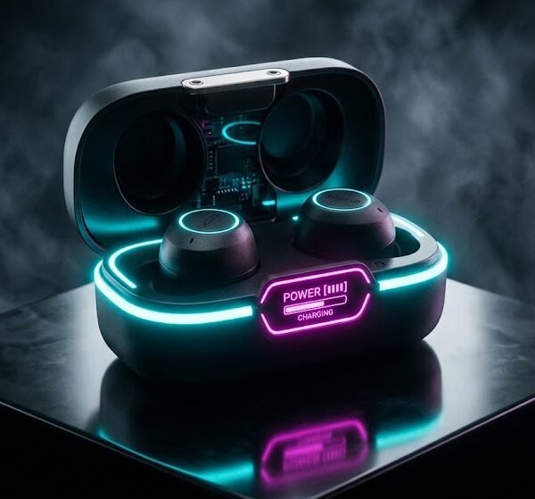
Tech products — needs clean, minimal composition and controlled reflections. Glossy tech surfaces (phones, laptops, speakers) pick up ambient reflections easily, so the prompt should specify a controlled, simple reflection rather than leaving it to chance.
The underlying rule: the category tells you which physical property is doing the selling — freshness for food, sparkle for jewelry, refraction for fragrance, texture for shoes, restraint for tech — and the prompt should be built around protecting that one property first.
Real Prompt Testing
A few practical patterns show up consistently when testing prompt variations side by side.
Changing only lighting (same product, same surface, same angle): switching from flat overhead diffused light to a single-direction softbox noticeably increases perceived depth — shadows and highlights on the product become more defined, and the product reads as more "photographed" rather than "rendered." This is usually the single change that most improves how realistic an image feels.
Changing only camera angle (same lighting, same product): moving from eye-level to a 45-degree elevated angle changes how much of the product's top surface is visible, which matters a lot for anything with a distinct lid, cap, or opening. Low-angle shots of the same product tend to make it look more substantial and premium, even with identical lighting.
Changing only backdrop (same lighting, same angle): swapping a plain white background for a textured stone surface introduces subtle reflected color onto the product's lower edge — worth knowing if exact product color accuracy matters, like for cosmetics where true-to-shade representation is important.
The practical takeaway: when troubleshooting a prompt that isn't producing what you want, change one variable at a time. Changing lighting, angle, and backdrop simultaneously makes it hard to tell which change actually caused the improvement — or the problem.
Before You Generate
Before you run a prompt, take thirty seconds to check it against these questions:
- Is the product named specifically, with material and color?
- Is there a surface AND a background described (they're not the same thing)?
- Is there a lighting instruction — type and direction?
- Is the camera angle or framing specified?
- Do the style/mood words agree with each other, or are they fighting?
- Are props limited to one or two, and relevant to the product?
- Is there a shadow/reflection detail to ground the product in the scene?
- Have you avoided asking for readable text or a precise logo?
If you can answer yes to all eight, the prompt is ready.
Quick Prompt Checklist
- Product (name, material, color)
- Surface/Backdrop
- Lighting (type + direction)
- Camera (angle/lens language)
- Mood (one consistent tone)
- Color (dominant + accent)
- Props (1–2 max, relevant)
- Quality keywords (realistic, commercial, high detail)
FAQ
1. Why does Gemini sometimes ignore part of my prompt?
Long prompts with instructions scattered out of logical order tend to get partially ignored. Group related details together (product → material → surface → lighting → camera) rather than mixing them randomly.
2. Should I use commas or full sentences in prompts?
Comma-separated descriptive phrases tend to work as well as full sentences, and are often easier to edit and reorder. Full sentences can help when you need the model to understand a relationship between elements (e.g., "light coming from behind the bottle, casting a shadow toward the camera").
3. How long should a product photography prompt be?
Long enough to cover product, material, surface, lighting, camera, and mood — usually 2–4 sentences worth of detail. Beyond that, added length tends to add redundancy rather than new instruction.
4. Why does my product look distorted in some generations
Complex geometric products (open laptops, multi-part packaging) are harder for image models to render accurately. Simplifying the described shape or generating multiple variations and picking the best often works better than trying to force accuracy through more adjectives.
5. Can I get the same exact background across multiple product prompts?
Describe the background as specifically as possible (exact surface material, exact color, exact lighting direction) and reuse that same wording across prompts. Identical wording produces more visually consistent — though not pixel-identical — results.
6. Why do my reflections look wrong or missing?
Reflections need to be explicitly requested ("subtle reflection on the surface below"). Without this instruction, many surfaces that should be reflective (marble, glass, glossy tabletops) render as flat and matte instead.
7. Is "8k" or "4k" actually useful in a prompt?
These terms function more as a signal for sharpness and fine detail than a literal resolution instruction. They can help push toward crisper detail rendering, but won't outperform good lighting and composition instructions.
8. How do I keep product color accurate?
Name the exact color and finish (matte forest green, not just "green"), and be cautious with colored backdrops or lighting that could tint the product — warm lighting especially can shift how a color reads.
9. Why does my prompt work for one product but not another?
Different product shapes and materials respond differently to the same lighting and angle instructions. A prompt built for a matte ceramic jar may not transfer directly to a glossy glass bottle without adjusting the lighting diffusion.
10. Should I include the brand name in the prompt?
Brand names alone rarely influence output meaningfully unless the model has strong visual associations with that brand, and even then, results are inconsistent. Describing the actual product appearance directly is more reliable.
11. Can I generate text or a logo directly on the product?
Readable text and precise logos remain a weak point in AI image generation. It's generally more reliable to generate the product without text, then add branding in post-production editing.
12. What's the difference between "surface" and "background" in a prompt?
Surface is what the product physically sits on (a table, marble slab, fabric). Background is what appears behind/around it in the frame (a wall, blurred scenery, solid color backdrop). Describing both separately gives more control than a single vague "setting" word.
13. Why do flat lay prompts sometimes look uneven?
Flat lays need diffused, even overhead lighting specified directly — without it, the model may apply directional lighting that creates uneven shadows across multiple objects laid flat, which looks off in a top-down shot.
14. How many props is too many? More than two supporting props usually starts pulling visual attention away from the product itself. If props start out numbering more than the product itself, consider whether they're necessary at all.
15. Do quality keywords like "ultra-realistic" always improve the image?
They push the style toward photographic realism rather than illustration, which helps most product photography use cases — but they can't compensate for missing lighting or surface instructions. Quality keywords refine style; they don't add missing information.
Also Read :Why Prompt Clarity Matters More Than Prompt Length
Final Tips
Build one solid prompt structure and reuse it as a template — swap the product, material, and mood words rather than rewriting from scratch every time. Consistency in structure produces consistency in output quality.
When something looks off, change one variable at a time (lighting, then angle, then backdrop) instead of rewriting the whole prompt. It's the fastest way to actually learn what each part of your prompt is doing.
And don't ask the image model to do post-production's job — logos, precise text, and exact brand typography belong in an editing tool afterward, not in the prompt itself. Save the prompt for what AI image generation is actually good at: light, material, mood, and composition.